Terms in Graphic Design Designers Must Know
There are many terms in graphic design that must be known. Curious, right? Moreover, the designers, of course, the more curious. Let’s just read this article.
Terms in graphic design:
1. Vector and Raster
![]()
(Source: Google Image)
A raster or bitmap is an image made of an arrangement of colour pixels or an arrangement of colour dots, while a vector is an image created with polygons in computer graphics. Raster or bitmap image-based software includes Aviary, Adobe Photoshop, Corel PhotoPaint, GIMP, and Artrage, while vector-based software includes Coreldraw, Macromedia Freehand, Corel Designer, Adobe Illustrator, and Xara Xtreme. Graphic design results in the form of raster or bitmap images will be in .bmp, .jpg or .jpeg, .psd, .tif, and .gif formats, while vector images can be in .svg, .ai, .eps, or .pdf formats. Vector images are preferred by designers because they have higher specifications than raster images for making logos, illustrations, and other graphic images.
2. RGB and CMYK
![]()
(Source: Google Image)
CMYK stands for Cyan, Magenta, Yellow, and Black colours. This colour is used in printing for colour settings in the production of posters, brochures, and others. Meanwhile, RGB stands for Red, Green, and Blue. RGB is applied for colour settings on televisions, computer screens or monitors, smartphones, and others. So, pay attention if you want to do colour settings.
3. DPI and PPI
![]()
(Source: Google Image)
![]()
(Source: Google Image)
DPI (Dot Per Inch) is a measure of the spatial printing and point density of a video or image scanner. The more inches, the better the image quality. The inch number of printing is 300 dpi. PPI (Pixels Per Inch) is a unit that expresses the density of pixels. If an image is enlarged in PhotoShop the inches will decrease and the image quality will decrease too. That resolution is only on raster images.
4. Typography

(Source: Google Image)
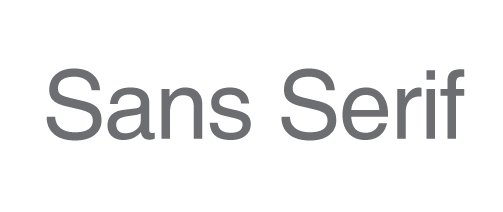
(Source: Google Image)
Typography is a technique of selecting and arranging letters with certain rules to produce a certain impression. A graphic designer must be good at choosing letters, whether it’s serif or sans serif. Serif font is a typeface that has small horizontal lines on the body of the letter. While Sans Serif typeface is a typeface that does not have small horizontal lines on the body of the letter.
5. GRID
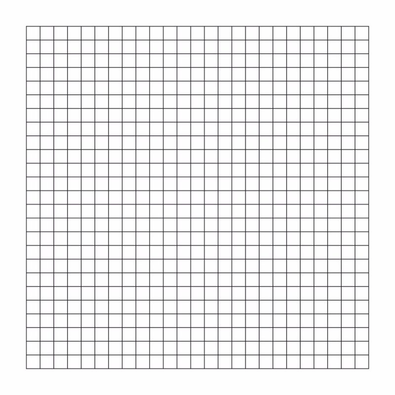
(Source: Google Image)
A grid is a structure in the form of vertical, horizontal, and curved lines to create a design framework. Some graphic design software has a different grid display.
6. Logo And Brand Mark
![]()
(Source: Google Image)
The logo is powerful graphic design work. Definition the logo itself is an identity of a company. A good logo will definitely last a long time and be known by people. A logo is different from a brand mark, a brand mark is a symbol and design of a product.
Alright, that’s the lesson for this time, thank you for reading and happy working.
