Importance of Color Selection in Graphic Design
Color is a necessary element in graphic design. Color can illustrate emotions of art, so it can be accepted by enthusiasts. Color elements could picture nature as blue to picture the cloud, soft yellow to the sun, and red for fire. As a designer, you must recognize the importance of color selection.
Importance of Color Selection
Color is an element that could influence someone’s mind and mood. Color has a big effect on human psychology, so color is divided into some categories. In design, you should know about colors harmony, matching combination between color and another.
There are some formulas used to harmonize a color selection in design.
1. Analogous Colors

(Source: Google Image)
Analogous colors are a group of three nearby colors in color wheel. The colors have the same substance with a dominant color such as red, orange, and red-orange. Analogous colors scheme will make rich and monochromatic looks. Its combination will produce a warm or cold color that has accurate harmony and temperature.
2. Complementary Colors

(Source: Google Image)
Complementary colors are a combination of opposite colors in wheel color like green and red. Combination of colors results in high contrast and dynamic effect, especially when it is added full saturation. The complementary color is not suitable for large usage, but good to give accent in an object, except text.
3. Triadic Colors

(Source: Google Image)
Triadic colors scheme is a color composition that shape triangle in wheel color. Triadic color adds an attractive effect though you choose a pale color. Get the best result in apply triadic colors by choosing a color to make domination and select other as an accent.
4. Split-Complementary

(Source: Google Image)
The split-complementary scheme is a combination between the base color and the opposite of complementary colors in color wheel. This combination usually used by beginners to learn how to make a perfect formula.
5. Rectangle/Tetradic

(Source: Google Image)
Rectangle color scheme contains four colors which arranged into two pairs of complementary color. This scheme is possible to create any variations. You can choose one as the main color and another as an accent if you decide to use rectangle scheme.
6. Monotone Chromatic
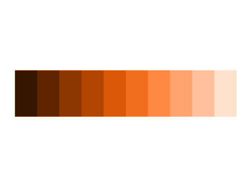
(Source: Google Image)
Monotone chromatic is a combination of colors with different saturation become an attractive blend.
7. Monotone Achromatic

(Source: Google Image)
Monotone achromatic is a combination of colors in line from white to black.
Easy Tips to Select Color
When designing artwork, you need to select suitable colors. This is tips to select color might useful for you.
1. Prepare your theme and effect to create a design such as natural, modern, classic, and vintage.
2. Find proper photos and illustration based on your theme. Whether it from photo stock sites or your own images, you can arrange.
3. Pick a color sample from your favourite illustration.
To find different color codes: https://www.toptal.com/designers/colourcode

4. Create a design by image editing software like Adobe Photoshop, Corel Draw, and Illustrator.
5. Use sample color to make your design, from header, headline, to background.
6. Make composition by some alternative features.
Finally, you realize how is the importance of color selection in graphic design. With knowledge in color combinations, you must create an influencing and amusing artworks.
